·5 min read
I Spent a Week Auditing UI/UX. Here's What Actually Matters.
After a week of hands-on UI/UX auditing and mobile testing, here's what I learned about what makes good design — and why simplicity always wins.

I spent the last week doing something most people skip entirely: manually testing websites on mobile.
Not reading blog posts about UI/UX. Not watching YouTube breakdowns. Not studying design theory.
I opened real sites on real devices. Tapped every button. Tried every flow. Broke things on purpose. Noted every moment of friction, confusion, or delay.
Here's what I actually learned.
Why UI/UX Matters More Than You Think
Most people treat UI/UX as a design decision. It's not. It's a business decision.
Every extra tap, every confusing label, every slow-loading page is money walking out the door. Mobile users bounce within 3 seconds if something feels off. Not broken. Just off.
When I was auditing sites this week, the pattern was obvious. The ones that converted weren't the prettiest. They were the clearest. Clear navigation. Clear CTAs. Clear next step. That's it.
Good UI/UX doesn't make people go "wow." It makes them go "that was easy."
The Flows That Actually Work
After testing dozens of pages, a few patterns kept showing up in every site that felt good to use.
1. One Primary Action Per Screen
The sites that worked best had one thing they wanted you to do on each page. Not three CTAs. Not a sidebar full of links. One clear action.
A homepage with "Get Started" front and center. A product page with "Add to Cart" where your thumb naturally lands. A checkout with nothing but the next required field.
When you give people too many choices, they choose nothing. This isn't opinion — it's Hick's Law, and it's been tested for decades.
2. Thumb-Zone Design
Here's what most sites get wrong: they design on desktop and "make it responsive." That's backwards.
On mobile, the bottom third of the screen is prime real estate. That's where your thumb naturally rests. The top of the screen? That's the hardest place to reach on a phone.
The best mobile experiences put the primary CTA at the bottom. Navigation is reachable. Forms start with the easiest field. Everything flows downward, not upward.
I was auditing a site this week where the main "Book Now" button sat at the very top of the mobile layout. Nobody was clicking it. Moved it to a sticky bottom bar — the flow made instant sense.
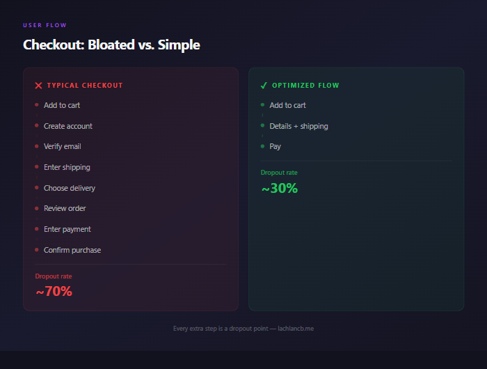
3. Kill the Unnecessary Steps
Every step in a user flow is a dropout point. Every. Single. One.
The checkout flows that convert best in 2026 are dead simple: cart → details → pay. Not cart → create account → verify email → enter details → review → confirm → pay.
Same principle applies everywhere. Contact forms? Name, email, message. Done. Don't ask for phone number, company size, and budget range unless you're qualifying enterprise leads.
If a field isn't mandatory for completing the action, remove it.
4. Visual Hierarchy Is Everything
When I tested sites that "felt right" on mobile, they all shared one thing: I never had to figure out what to look at first.
Big headline. Supporting text underneath. One button below that. Whitespace between sections.
The sites that felt chaotic? Multiple font sizes competing for attention. Buttons that blended into the background. Text walls with no breathing room.
Good visual hierarchy means the user's eye follows a natural path. You're not designing — you're directing attention.
AI Websites and the UI/UX Gap
Here's where it gets interesting. I've written before about how AI just killed the $5,000 homepage. Tools like Framer AI, Relume, and Wix ADI can generate a decent-looking site in minutes.
But "decent-looking" and "good UX" are two completely different things.
AI website builders are great at generating layouts. They're terrible at understanding user intent. They'll give you a beautiful hero section with three equal CTAs because they don't know which one matters most. They'll build a mobile layout that technically works but doesn't account for thumb zones. They'll create navigation that looks clean but buries the page your users actually need.
I've also talked about how AI design tools are changing the game for speed. And they are. But speed without intention is just fast mediocrity.
The AI tools handle the production side brilliantly. Color systems, spacing, component libraries — all solved. What they can't do is the thinking side. Which flow converts? Where do users drop off? What's the actual job this page needs to do?
That's still a human problem. And it's the only part that matters.
The One Rule: Simplicity Wins
After a full week of auditing, testing, and breaking things, the biggest takeaway was the simplest one.
The best UI/UX is the one the user doesn't notice.
No fancy animations. No clever interactions. No "look what we built" moments. Just a flow that takes someone from A to B with zero friction.
Here's my framework now:
- Can you complete the primary action in under 3 taps? If not, simplify.
- Does the mobile layout work with one thumb? If not, rearrange.
- Is every element on the page earning its space? If not, remove it.
- Would a first-time visitor know exactly what to do? If not, clarify.
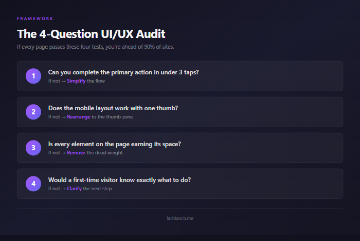
That's the whole checklist. Four questions. If every page passes these four tests, you're ahead of 90% of sites online.
What This Means If You're Building
Whether you're building an ecommerce store, a service business site, or a SaaS dashboard — the principles are the same.
Stop studying and start building. Open your site on your phone right now. Tap through your main user flow. Time how long it takes to complete the primary action. Note every moment of hesitation.
That five-minute test will teach you more about your UI/UX than any course or framework.
The tools have never been better. AI handles the production. But the thinking — the clarity, the simplicity, the user empathy — that's still on you.
Keep it dead simple. Your users will thank you with their wallets.